
Fate is a funny thing; the ancient Greeks believed it was the Moirai, who controlled fate through the art of spinning and weaving. One crone to hold the string, another to measure it out, and the final crone to decide when it is time to cut.
Penelope, the wife of Odysseus in Homer’s Odyssey, was a weaver; it was said that she would weave a shroud by day and unravel it by night to keep potential suiters at bay while she waited for Odysseus to return.
The Roman poet, Publius Ovidius Naso (Ovid), wrote about the story of Philomela: a Princess raped by the husband of her sister. The husband threatened her to keep silent, but she was defiant, and had her tongue cut out as punishment.
Unable to speak, she wove the story into a tapestry and sent it to her sister. The sisters killed the sons born to the husband and served them to him in a meal; praying to the gods for protection, Philomela and her sisters were turned into a nightingale and a swallow.
Weaving, one of the oldest skills, is intertwined in everything: from our myths to our clothes, and yet it is a medium that is under-acknowledged.

Caitlin adjusting loom [Emma Jepsen]
UAL weaving student Caitlin Hartmann will be attending the show with samples of her textile work and hopes that she will be able to sell her unique designs.
Caitlin has chosen to interoperate with the Premier Vision brief, ‘Revelry’, in a fantastical way, coincidentally in spirit with the myths and stories surrounding the actual skill. “I wanted to look at something much more frivolous essentially. The brief itself is called ‘Revelry’ so you want it to be something fun” Caitlin said. Drawing inspiration from the nature of Scotland, her own photography, and exhibitions she had seen recently, she emphasised a William Blake exhibition at the Tate Britain.
Caitlin showing images from the William Blake exhibition at the Tate Britain [Emma Jepsen]

Caitlin at her loom [via. Emma Jepsen]
“When I looked down the pathway of the Lady of the Lake, a lot of the poems that were written about her were all based on lakes in a really Moor-y Scotland and by the lochs; so, it is really misty and blue, pale and magical in that sense”.
During her trips to Scotland, Caitlin’s photography is mainly based on different elements of water, mist, and fog. That kind of drew me down a pathway of looking at things from woodland to water”.
While on one of her trips to visit her dad in Scotland, they went to a new restaurant that opened in Newport-on-Tay. The restaurant has an amazing view over the river Tay, allowing guests to see two bridges that cross the river to Dundee.
“I photographed it whilst I was in the restaurant at lunchtime and it had the most beautiful foggy-misty scene, and different tones of blue”. Caitlin prints all her photographic research out on high-quality photography paper as the colour can change drastically from what is seen on a phone and what is seen in real life – this always helps with colour matching when shopping for yarn.
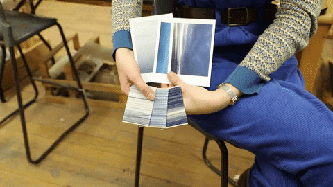
Caitlin showing yarn colour matched to photo of Newport on Tay [gif via. Emma Jepsen]
The pictures were all taken at different times of the day during the visit, which gives a much richer sense of tone to the area, as well as an understanding how a place can change so drastically.

The main clue collection taken from the restaurant in Newport on Tay. Dundee is visible in the background [Caitlin Hartmann]

Moody skies at dusk [Caitlin Hartmann]
The greys and blues tie well with the main blue collection seen above. However, the photo also has whites and pinks, offering further connection with the more moss and tree oriented pictures and their colour scheme.
The greys featured in the photo are also similar to the greys used in William Blake’s ‘Oberon, Titania and Puck with Fairies Dancing’, as well as the light peachy pink.

A delicate flower held up to the mass of a pine tree forest, creating contradiction but also harmony. [via. Caitlin Hartmann]
This colour palette stays coherent throughout all the natural and earthy research photos – it is important to note that black is never used in any of the windings as it is much too harsh.

Bark of a tree that looks like the wings of gathering Faries [via. Caitlin Hartmann]

Fairy wings in a tree stump? [Caitlin Hartmann]
The navy used in the natural windings is also keeps up with the main trio of blues taken at the Newport on Tay restaurant. “I didn’t want to make it too harsh, I wanted to make it like it bonded with the rest of the work.
I am using these navy colours in some of my other pieces I thought it translate easier into the blue sections”.

Earthy colours of the woodland [Caitlin Hartmann]
The colour scheme of greens and delicate reds and oranges, the reminiscence of autumn before winter, stay the same but the context changes giving it new meaning and understanding.
![side by side comparison of the winding (string colour palette] and the photograph of a leaf](https://www.artefactmagazine.com/wp-content/uploads/2020/01/Screenshot-2020-01-28-at-00.18.07-e1580208355127.png)
Images ready for weaving [Emma Jepsen and Caitlin Hartmann]
The research that goes into developing one of Caitlin’s textile designs is not always necessarily imagery-based. “I often think it is quite hard to look into what other weavers might do; It’s amazing to see the history of weave before you, but to then translate that into your own work can often be seen as copying”.
Instead Caitlin would rather draw inspiration from fine artists and other textile designers, and then go off a do research through photography and drawings. “It is a process of looking at the world around you based on the influence of the theme that you are going for, and then translating that through paintings in my art book, that will form the basis.”
Alternatively, lots of inspirations or research for Caitlin’s projects comes from interviews with people that are relevant to the chosen theme. “I will start, quite unusually I think, from a word basis to then get colour depictions and ideas from”.

Caitlin colour matching palettes with photos [Emma Jepsen]
During a trip to Morocco, Caitlin met a boy, same age as her and in the same point of life, who’s perspective of Morocco became the ground research for the project.

The coliur od Morocco [Caitlin Hartmann]
“One of his answers that really caught me was when I asked him to summarize it through this colour perceptive, he said that he saw it as a mixture of dark colours with small drops of red that are filled with the love that his family have for him. That then formed the grounds for the majority of my weaving”.
Caitlin made her warp threads, the threads used to weave into, out of blue-black and green threads. An extra warp, which you can bring in and out of the weaving, of red thread was used to convey the red drops filled with familiar love. She conducted three formal interviews with her friend: one in the beginning, one in the middle, and one in the end, to keep a constant communication between research and researching – like live fact-checking.
After the first interview, Caitlin created a colour pallet purely based off of what she had been told, this helped her make colour studies surrounding the raw pallet.
She sent them to her friend and asked if this is what he meant when he was being interviewed the first time, “the colours had changed meaning; I showed him a colour of red, he said initially it meant happiness but I mixed it with a much darker tone and added some different bits of black to it, so he said no, this now represents more of a depression.

Colours connect to emotions [Caitlin Hartmann]
The final piece was very different to the initial samplings that Caitlin has made and become attached too, but the end result was a harmonious mix between what she had seen in Morocco as a visitor and what he had experienced in Morocco as a native – further emphasising her original understanding of differing perspectives despite being that same age and at the same point of their lives.

The final product reflects the colours and feeling of the place and the people[Caitlin Hartmann]
Research stemming from a word basis to create colour depiction was only a recent methodology that Caitlin experimented with during her foundation year – at the beginning of her fascination with textiles.

Different designs and colours reflect the varying emotions of the places and people [Caitlin Hartmann]
Caitlin interviewed her twin sister about her relationship with their father, one that has always been very interesting, she also went ahead and interviewed her.
She also spoke to own father about his relationship to his fathers, “he has his biological one and his stepfather, both of who he has had really difficult relationships with at times… his biological father he did not speak to for 10 years for different reasons, he understood that having two [fathers] did not change the love”.

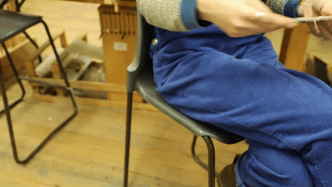
Caitlin preparing to cut thread on loom [Emma Jepsen]
The final piece became very 3D based and interactive for the audience, shown alongside snapshots of the various interviews that Caitlin had done. The main element in the final piece were three large pieces of wood that had been found at a wood recycling place near Caitlin’s house.
“There are these massive pieces of wood that they have, that people have donated or cut down from trees to help repurpose them. They have their own workshop and factory which they make handcrafted items from. I picked this one huge piece of tree with the bark still attached on the edges, which is really rough and natural. They cut it down for me into three pieces which formed the three pillars, where I discussed visually the interpretation of my research”.
Caitlin’s discussion included ceramics found at a workshop that had many old forgotten pieces of china that people did not want anymore; she smashed them against the patio of her home, stemming from her research-based on Ai Weiwei’s installation of a precious vase that had been broken, thought to be high in value.
Caitlin’s own china was repurposed to look like they were coming out of the wood itself – perhaps this can be interpreted as something to do with broken trust. Caitlin also cut out blocks of wood from the bottom of her three pillars, inserting rocks and roses trapped in resin, “trapped in a state of decay,” hanging from string in the now open space.
With the spare wood that she had cut out, she burned it in her garden and featured the ashes at the bottom of each pillar. Her final major project piece is much more multimedia oriented than what she is working on now, “but I would not ever limit myself to one form of medium, because there are so many different ways to express feelings and information that I get.”

Wood and weave [Caitlin Hartmann]
She will be based in a rural village in north-east India, Nagaland, where she will be able to learn their indigenous techniques of weaving, using a back-strap loom, which is much different the weaving technique she has currently been doing – and not something available to her currently at University.
“It is pretty much the furthest region of India that you can go to, so it has a really interesting cross-cultural mix of its surrounding areas. It is a very tribal area, so it will be really interesting to learn about their culture and history,” she said.
“I am really excited to go and learn about how they do it, and get that real cultural sensitivity to what they are doing but understanding how it works in the wider context of the world”.
The prospect of being able to travel around the world learn how other cultures weave and what it means to them is a much more attractive thought of life after University for Caitlin.
Having a cross-cultural exchange of knowledge that would allow someone to find ways to improve businesses, work as a part of the community, “and not just take from them and what they give me, but also see how I can interact with them on a very holistic level.” Caitlin’s interviewing technique would come in handy in such a life – almost like a weave-specific anthropologist.
The interviews that Caitlin will conduct while in India will work as a ground basis for her final major project as well as the final major project essay. It is all about understanding who they are, who she is in relation to them, as well as understanding their interactions together and the connections she will undoubtedly make; similar to her work in Morocco.
“A lot of their weaving is very culturally rich in heritage and have very specific meanings, and they do not want to have that appropriated and sent out to the western world of fashion to have that extrapolated from them. I really want to understand their real sacred sense of weaving”.
You can follow Caitlin’s artwork on Instagram @caitlinannatextiles
Featured image by Emma Jepsen.
Edited by: Mischa Manser & Kesia Evans.